 By Scott
Hey Atlanta Thrashers. You suck, and so do your uniforms. And your crowd for that matter, too.


How can they improve? The 'American Flag' alternates show that the Nats have taken some initiative, just over-the-top/unsuccessful initiative. First off, the Nationals are based in the nation's capital. Their logo is red, white, and blue. So, why are their jerseys white, red, and gold? So many great possibilities with America's emblems at their disposal, yet the Nats continually fail to get it right. The American Flag jersey is a little bit too much, but if they can build on that, Washington will take the first step in becoming a winning franchise.
"When you look good, you play good." Some famous athlete once said that. I think it was Deion Sanders, but for some reason I also think it was Jerry Rice. Regardless, there are far too many teams with simply awful uniforms. And in the wake of the Lions, 49ers, and Jags all looking to reverse their recently poor fortunes by getting some new threads, Mel Kiper's Hair takes a look at some other franchises who could swap their curreant attire for some new swag.
First, let's go over the methods teams with bad jerseys can take to rebuild.
1. Go old school. Every team has a great throwback somewhere, incorporate it into your new jersey.
2. The fierce logo. What's more intimidating than a fiercer logo? I don't know, you tell me.
3. Subtle change approach. Includes rounding out your logo, essentially making it more sleek. Or, tweaking numbers and pants stripes. Any kind of a modernization.
4. Simple. Some teams go way overboard when it comes to remodeling. Sometimes it's best to just stick with what you have. At least until you can recoup and come up with something nice.
Jersey theory.
Great jerseys=Great teams. Especially recently, bad uniforms do not win. Look at last year's champs: Red Wings, Celtics, Steelers, Phillies.
NFL:

Cincinnati Bengals: Everything in Bengal-land seems to be headed in the wrong direction. The team parted ways with their last bright spot in T.J. Houshmanzadeh, signed another convict in Tank Johnson, and Marvin Lewis is still their head coach. With a measly 19 wins over the past 3 seasons, the Bengals could use some kind of rejuvenation, and getting away from these would be a step in the right direction.
How can they improve? At this point, the Bengals have about 10 different combinations of uniforms. My advice: Go back to your roots. Nothing positive has come out of the most recent jersey change, so why not build off your storied history? Get rid of the bengal stripe down the side and stick to an all-white jersey and maybe a black and white. Either way, the key for the Bengals is get simple and get original; build off the throwbacks and get the franchise back to NFL prominence. Oh yeah, and fire Marvin Lewis.
Cleveland Browns: I realize the Browns have the historical issue on their side, and have essentially kept their jerseys intact for their entire history. However, for a team in a complete rebuilding mode, fresh uniforms could really restore some swagger for the Browns.
How can they improve? While Cleveland's jerseys aren't notably bad, they're simply boring. I know the Browns have never sported a logo, but why not try. And since I'm sure most Browns fans may object to that, the organization should at least attempt some kind of modernization or new color scheme.
MLB:

Washington Nationals: How can I describe the Nationals? In the words of Sir Charles: Turrible, Turrible, Turrible. Bad uniforms, bad players, bad management. Washington has proven incapable of building any kind of foundation for a successful team, and can't even spell their own name right.
Pittsburgh Pirates: Essentially, everything about the Pirates is bad. They haven't had a winning season in...a long time, and even worse their uniforms are just not cutting it. Fortunately, the Pirates did take some progressive steps in improve their jerseys this year, and already things are looking up for them. They adopted a black alternate jersey that has a nice throwback touch to it. Pittsburgh is starting to catch on the jersey theory here. New uniforms and they're off to a hot start. The Pirates even completed a sweep of the jump-start Marlins today and are half-a-game out of first. Oh, the power of the jersey.
How can they improve? Get rid of the vest all together. The Pirates replaced their home and away vests with traditional sleeves, but kept an alternate vest. Personally, I think the vest is really horrible, especially with the awkwardly long undershirts. Anyway, the last step for Pittsburgh is to reform the 'P' on the caps. Now that Pirates are actual global security threats, maybe it's time for the Pirates to shift away from the 'pirate-ness' of the hats with a rounder 'P'. It would make a subtle, but huge difference.
NHL:

Atlanta Thrashers: I'll try to condense my hostile feelings towards this "franchise" into a few sentences. Perhaps my biggest gripe against any organization in sports is the 'things' the Atlanta Thrashers call jerseys. Before I start, I understand that the Trasher is Georgia's state bird, but I don't think the Thrasher looks anything like this. Besides, why would a team playing the world's most violent sport name themselves after a small bird? This is why the Thrashers suck.
How can they improve? It was somebody's job to design these jerseys. More importantly, someone also created this (no longer in use, but still, you'd think they'd learn from prior mistakes. Guess not.)and this. First step, fire these people. Second step, burn every remnant of these things they call jerseys and start from scratch. Considering nobody knows what a Thrasher is, why not just change your logo to a bear. This gives Atlanta some nice flexibility in possibly designing a new logo and some new threads. Since that probably won't happen, Atlanta should try going Rangers-style and spelling out 'Thrashers' down the jersey. I know it's a copy-cat move, but it's desperation. Also, establish team colors. You can't just randomly throw new colors into an alternate jersey, Atlanta. Things don't work like that. Get with the system. Scrap the baby blue, stick with blue, white, and red. Boom.
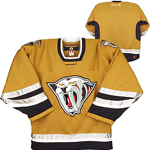
Nashville Predators: I can't honestly say that I've ever watched a Predators game, but I do know that Paul Kariya laced up the skates for some time with them. Nashville has some young talent and missed the playoffs by 3 points. With nicer jerseys, they get in.
How can they improve? The Predators seem to have adopted a saber-tooth tiger mascot. I can't say I'm a big fan. Oh yeah, and someone in the organization once designed vomit alternates. And people wonder why they struggle. A predator could essentially be anything, and the current logo is just awkward and boring. Nashville should start from scratch with a new logo, perhaps a sleeker tiger. A new logo is really all they need, the jerseys are clean and original. So, Nashville, new logo=playoffs.
Anaheim Ducks: I take back what I said about the Thrashers holding my biggest gripe against a pro sports franchise, because the Ducks take the cake. Maybe the single biggest travesty in sport's history, Anaheim ditched the Disney look (Possibly the greatest jerseys ever, is there anyone who did not like them? Honestly?) for the ugly look. They also dumped the 'Mighty' from their nickname. Is 'Ducks' supposed to be more threatening than 'Mighty Ducks'? What would you rather mess with? Anaheim does, however, disprove the jersey theory because they did win a Stanley Cup right after changing uniforms.
How can they improve? Go back to the old uniforms, sign Gordon Bombay as your head coach, pick up Charlie Conway's option, and win Stanley Cups. Yes, it's that easy.
NBA:

Oklahoma City Thunder: The Thunder is a young franchise, but that's no excuse to wear knock-off Knicks jerseys. I realize Thunder is a tough nickname to create a jersey for, and honestly I don't know why they chose Thunder over anything else. Hopefully, these are temporary and the team drops some nice uniforms before the team really gets good. Which will be very soon assuming they pick up a solid presence down-low in the draft.
How can they improve? This is the toughest assignment to improve, because I'm not really sure what you do with Thunder. Regardless, this logo needs to go, it's awkward and unappealing. Oklahoma City should scrap the logo and go with some more basic. Maybe just a basketball with Thunder written over it, or try to relate a theme to Oklahoma somehow. I don't know, but something needs to be fixed here.
Milwaukee Bucks: It's no surprise that one of the worst franchises in sports also has some of the worst uniforms. It feels like the Bucks haven't changed their logo in decades, and it hasn't gotten cooler. Granted, the Bucks, like the Thunder is not an easy nickname to work with, there has to be a better idea out there than this.
How can they improve? It may not be the logo that is dragging this team down as much as it is their colors. Forest green and purple-red don't mesh well, and to avoid looking like any kind of a Christmas Tree, the Bucks should just go in a different direction. Ditch the color scheme all together and go with a simple red and green. I know I just made a Christmas tree joke, but it's really the only way for Milwaukee to recover and look normal.
Trust me when I tell you this article could potentially turn into a book, as there are plenty of teams remaining on the bad jersey list. Maybe we'll get a part 2 soon.
Haha this is great. I love the links. Bengals and Seahawks are the worst in the NFL, although the Seahawks have gotten better since the 90's. Seattle could use some sweet black jerseys.
ReplyDelete